Penguin
Composition Rules

Recreating Jan Tschichold’s 1947 Composition Rules An Excerpt, for Penguin Books was a fun exercise to shine a contemporary light on this iconic typography guideline.

The classic colors of the original Penguin Books Logo are preserved and used in a playful and efficient way on all the pages of the new design, where the mix of a Serif Font on titles contrasts perfectly with the SanSerif Font used on texts and examples.

The design of this book was thought to make the user have fun while reading it. The Rules are always on the left, with three columns, on a white background page, titles in fading orange with their first letter occupying one column of the page and the explanation of the rules always in black occupying the other two columns of it.
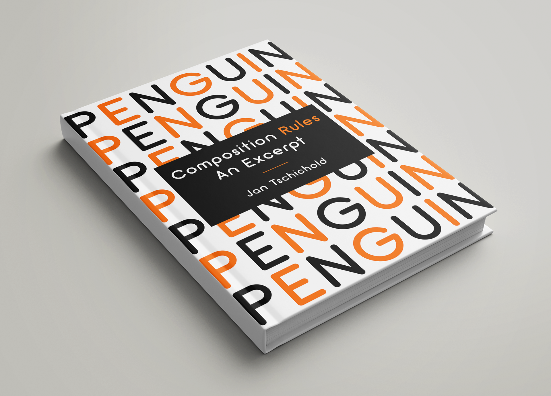
On the right opposite page, the example of the rule is placed inside of a, sometimes orange, sometimes black, frame pages with a variation of black, white, and orange background centers playing harmonious with the same variation of color in the texts.

Previous
Previous

Habitat For Humanity

Next
Next

The Only Way Out Is Through