Dautaj Hotel

The creation of the brand identity for this Albanian family hotel was inspired by the Countryā€™s flag, where the symbol is a silhouette of a double-headed eagle against a red background.

In the Logo, the eagle has his eye closed to indicate a peaceful and calm stay and it wears a crown on its head to bring a luxurious feeling. The eagle is inside a shape that represents the Sage leaf. Albania is the largest producer of sage in the world.
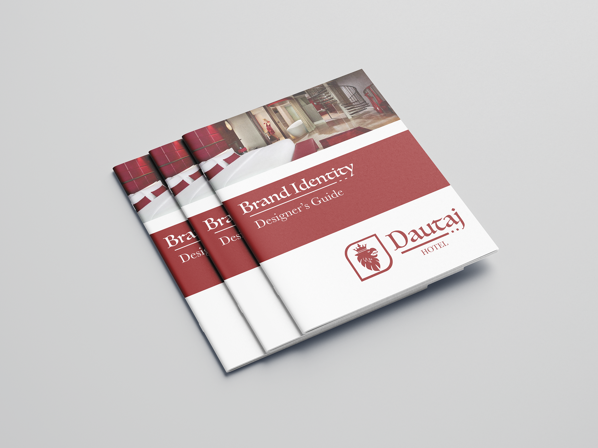
The Typeface was chosen to bring an exotic and sophisticated feeling and the line with two dots underlining it represents the letter ā€˜Dā€™ in Morse Code.

PROCESS AND STUDIES

Previous
Previous

The Only Way Out Is Through

Next
Next

Mad Queen Tea Parlor